Blood Test App Development: How to Build a Lab Results MVP With Specode

If you’re searching for blood test app development, odds are you’re not trying to invent a new lab standard. You’re trying to ship something patients and staff can actually use: a secure place to collect, view, and manage lab results—with clear roles, clear auditability, and a scope that won’t explode into “let’s just rebuild an EHR.”
This guide is built for that reality.
We’ll walk through a practical MVP you can launch as a web app: the minimum data model you need for test reports and abnormal values, the screens that make lab results readable (and actionable without turning your app into a diagnostic product), and the workflows that keep staff in control when something looks off.
You’ll also get a Specode-first build plan: how to assemble the app from reusable HIPAA-ready components, and how to use the AI builder to generate each module in a clean, testable sequence.
By the end, you’ll have a concrete blueprint you can follow:
- a simple but extensible structure for lab results (panels, analytes, ranges, attachments)
- patient-facing views that reduce confusion and “what does this mean?” messages
- staff workflows for review, acknowledgment, and follow-ups
- go-live basics: access control, audit trail, and release rules you can explain to a compliance person without sweating through your hoodie
Key Takeaways
- Start with workflow, not features: decide whether you’re building a lab viewer or a workflow tool, then lock a V1 journey (result arrives → stored → released → reviewed → follow-up → logged) so scope doesn’t sprawl.
- Keep V1 safely non-diagnostic: your app should display results clearly, flag abnormal vs critical, and route the next step to humans with acknowledgment and audit trail—helpful without pretending to practice medicine.
- Specode’s advantage is speed with structure: you can chat-build the app module-by-module using the AI Builder (roles, timeline, result details, review queue, tasks, audit log) and test each slice as you go, instead of waiting for a full custom build to “come together.”
Define “Blood Test App” by Workflow
Before you pick features, pick the workflow. “Blood test app” can mean three very different products, and each one drags a different level of complexity (and risk) behind it.

Three Product Types
1) Secure Lab Viewer (the Clean MVP)
A patient (and optionally a clinician) can access test reports, see abnormal values, and track history over time. Think: “results inbox” with clarity and auditability.
Best when: you’re validating demand, running a pilot, or your lab-result source is initially manual/file-based.
2) Workflow Tool (the Operations Play)
You still show results, but the real value is in what happens after: staff review queues, acknowledgment, routing, and follow-up tasks. This is where you reduce “results fell through the cracks” risk.
Best when: you’re building for a clinic/program and your success metric is turnaround time + fewer missed follow-ups.
3) Decision-Support Adjacent (the Danger Zone)
Now you’re not just displaying results—you’re telling users what they “mean” in ways that influence care. Even if you don’t intend to build a diagnostic product, this is where you can accidentally behave like one.
Best when: you have clinical governance, a clear risk posture, and you’re ready to treat this like a regulated-grade capability (most MVPs aren’t).
Rule of thumb: if you want to ship fast, start with (1) or (2). You can always grow into more sophisticated interpretation later—after you’ve proven the workflow and data are solid.
The V1 User Journey
Define your MVP as a chain. If a step isn’t in V1, say so now (future-you will thank present-you).
- Result arrives (manual entry, file upload, or a single source feed)
- Result is stored with patient association, timestamp, and provenance
- Result is released to the patient (immediately or after staff review)
- Patient reviews result details and sees flags for abnormal values
- Follow-up happens (message, task, appointment, or instruction)
- Everything is logged (who viewed, who released, what changed)
That’s it. That’s the product. Everything else is decoration.
Decide What You’re Optimizing For
You can optimize for all three eventually. You can’t optimize for all three in V1 without turning your MVP into a slow-motion science project.
- Speed-first MVP: manual/file ingestion + clean viewing + basic abnormal flags
- Safety-first MVP: staff review queue + release rules + acknowledgment tracking
- Automation-first MVP: integration + normalization + advanced rules (usually not V1)
V1 Scope Checklist
If it’s V1, you should be able to answer “yes” in one line:
- Do we know who can see which results (patient vs staff)?
- Do we know when results become visible to patients (release rules)?
- Can we clearly show test reports and highlight abnormal values without guessing?
- Can staff confirm review and trigger a follow-up task?
- Do we have an audit trail for key actions (release, view, edits)?
If any of those are “we’ll figure it out later,” congrats—you’ve just created the perfect conditions for scope creep and inconsistent UX.
V1 Scope That Stays on the “Non-Diagnostic” Side of the Line
If you’re building a blood test app, the fastest way to slow everything down is to drift from “results management” into “medical decision-making.” Not because it’s morally wrong, but because it changes what your product is—and what it has to prove.
A solid MVP does two things well:
- Shows lab results clearly and consistently
- Routes the next step to the right human workflow
Everything else is optional. Some of it is radioactive.

The Line You Don’t Cross
Here’s the simplest boundary that keeps your V1 sane:
- Displaying lab results = safe, expected, and shippable
- Explaining lab results = fine, if it’s educational and conservative
- Interpreting lab results as medical advice = you’re stepping into risk
In V1, avoid anything that sounds like:
- “This result means you have X.”
- “Start/stop/change medication.”
- “You don’t need to see a clinician.”
- “We’re confident this is harmless.”
Your app can be helpful without being brave.
Safe V1 Interpretation
Patients don’t just want numbers. They want to know whether to worry and what to do next. You can support that without becoming a pseudo-doctor.
Good V1 patterns:
- Plain-language definitions (“What is LDL?”)
- Context framing (“Ranges differ by lab; your clinician uses your full history.”)
- Conservative next steps (“If you have symptoms or concerns, contact your clinic.”)
- “Questions to ask” prompts that help patients prepare for a visit
What you’re doing here is reducing confusion, not making decisions.
The “Critical Values” Exception
Critical results are where the workflow matters most—and where most MVPs quietly fail.
A safe rule:
- Critical values trigger staff escalation first
- The system records who was notified and when
- Staff acknowledges the result and chooses the patient-facing next step
In other words: your product shouldn’t “handle” critical results. It should prevent them from being missed. If you do only one thing beyond displaying test reports and abnormal values, do this.
V1 Feature Filters That Prevent Scope Creep
When a new idea shows up (and it will), run it through three filters:
1) Does it change the product’s responsibility?
If it shifts responsibility from clinician workflow to your app’s judgment, it’s not V1.
2) Can we defend it in an audit trail?
If you can’t log the decision, the actor, and the timestamp, you’re building drama.
3) Does it require perfect data to be safe?
If it only works with normalized, complete, fully integrated data, it’s not an MVP feature. It’s a Phase 2+ feature wearing a trench coat.
Lock these guardrails now, because the next step is defining the data model—and once you start naming entities and fields, “just one more feature” becomes “just one more table,” and then suddenly you’re six weeks into schema regrets.
Data Model First: Your Schema for Lab Results
If you want this product to feel calm instead of chaotic, the data model has to be boring in the best way. Treat these objects as canonical—every screen and workflow should reference them consistently.
Core Entities
You can ship a surprisingly complete V1 with a small set of entities. Keep them clean and predictable.
Patient: Who the results belong to.
Provider or Staff: Who reviews, releases, and follows up. (You can start with a single “Staff” role and split it later.)
Lab Result: The top-level record for a test outcome. Think of this as the envelope:
- result date/time
- ordering context (optional in V1)
- status (new, reviewed, released)
- source (manual, uploaded file, integration later)
Panel: A grouped set of measurements under one result (e.g., “CBC,” “Metabolic Panel”).
Analyte: One measured item inside a panel (e.g., Hemoglobin, Glucose), with:
- value
- unit
- flag (normal/abnormal/critical)
- optional note
Reference Range: The context for interpreting the analyte (range, thresholds). Store it so you can display “why it’s flagged,” not just “it’s flagged.”
Attachment: The original test report file (PDF/image), plus metadata:
- file type
- upload time
- who uploaded it
- which Lab Result it belongs to
Comment or Note: Human context. Patients ask questions, staff leaves internal notes, clinicians explain next steps.
Task: The follow-up engine: call patient, schedule visit, repeat test, request missing info—whatever your workflow requires.
Audit Event: The “who did what when” record:
- viewed
- edited
- reviewed
- released
- escalated
- exported/shared
If you’re tempted to add a dozen more entities, it’s usually a sign you’re building Phase 2 features in disguise.
Raw vs Normalized Data
You want two layers of truth, because they serve different purposes.
Raw data is for traceability.
This is the original attachment or payload as received. You keep it because:
- it’s defensible (“this is what we got”)
- it’s useful when structured data is incomplete
- it’s the anchor for audits and disputes
Normalized data is for usability.
This is the structured, queryable representation:
- panels, analytes, values, units, flags
- reference ranges
- timestamps and statuses
Why both matter: patients and staff need clean screens, trends, and search. But when something looks wrong, you need to point to the original report without playing telephone with the truth.
A simple V1 pattern:
- Always store the attachment (raw)
- Store just enough structured fields (normalized) to render the timeline, details view, and abnormal flags
Access Rules and Role Scoping
This is where a lot of “MVPs” quietly fail: they build screens before they define who can see what. Define access rules now and you won’t be patching leaks later.
Patient
- Can view only their own Lab Results, Panels, Analytes, and Attachments
- Can add Comments (patient-visible)
- Can’t edit results
Provider or Staff
- Can view patients in their scope (assigned list, clinic scope, or program scope—pick one for V1)
- Can review and release results
- Can create Tasks and internal Notes
- Can mark acknowledgment/escalation
Admin
- Can manage configuration (reference ranges, thresholds, roles)
- Can view audit trails across the system
- Should not casually browse patient results unless that’s explicitly part of the role definition
One important nuance: “in scope” must be deterministic. If your rule is “any staff can see any patient,” you’ve chosen speed over privacy. That’s a decision—not an accident.
This is also where patient and provider profiles stop being “user records” and start defining real scope—who can see which results, who can act on them, and who’s accountable for follow-up.
Screens You Can Ship in V1
Forget the “feature list.” If your V1 doesn’t work on actual screens, it doesn’t work.
Below are the core screens that make a blood test app feel trustworthy. Each one has a job to do, and each one must prove something. If it can’t prove it, it doesn’t ship.
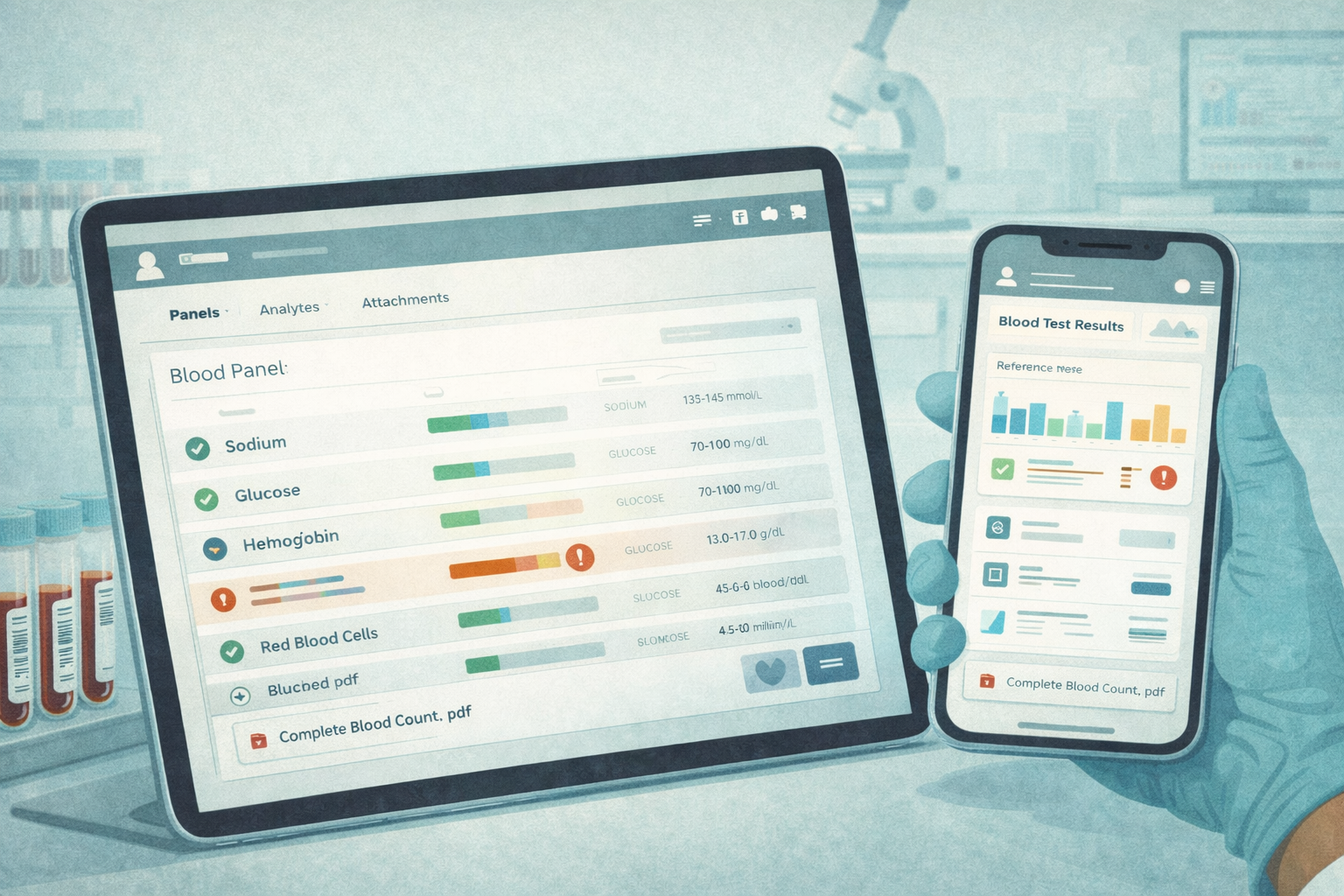
Patient Results Timeline
This is the home screen. If it’s confusing, the whole product feels unsafe. A calm patient onboarding experience here matters more than clever UI—because the first thing users do after signing in is check whether something looks wrong.
What It Must Show
- A chronological list of lab results (most recent first)
- Clear status: New, Reviewed, Released (use whatever terms fit your workflow, but don’t get cute)
- At-a-glance flags for abnormal values (don’t force a tap to discover “something’s off”)
- Last updated timestamp (people obsess over freshness)
- Source indicator (e.g., uploaded report vs entered result) so users understand why formatting may differ
What it Must Prove
A patient can immediately answer: “Do I have new results?” and “Is anything abnormal?” without reading a novel.
Common V1 Mistake
Overloading the timeline with interpretation. The timeline is for triage, not education.
Patient Result Details
This is where clarity matters most. The job is not to impress. It’s to reduce confusion.
What It Must Show
- Panel grouping (so a lipid panel doesn’t look like random numbers)
- For each analyte: value, unit, reference range, and flag
- A simple trend cue where it helps (a tiny sparkline is enough when prior data exists)
- Attachments (original report) available from the same screen
- A short “What’s next” block that routes to the right action (message clinic, schedule follow-up, etc.) without pretending to diagnose
What It Must Prove
A patient can understand what changed since last time and what they should do next—without the app roleplaying as a clinician.
Common V1 Mistake
Showing ranges without context (or worse: inconsistent ranges per result). If you can’t explain why it’s flagged, don’t flag it.
Patient Share and Export
Sharing is a real-world behavior: people send results to a spouse, a specialist, or a second opinion. If you don’t support it, they’ll screenshot everything and your UX loses.
What It Must Support
- Export as a clean summary (PDF is fine)
- A share mechanism that’s deliberate (time-limited link or controlled download)
- A clear “what was shared” view so patients don’t lose track
What It Must Prove
Sharing doesn’t become a privacy loophole. Every share/export action is logged, and the user experience makes it obvious that sharing is an intentional act.
Common V1 Mistake
Making sharing so hard people resort to screenshots. Screenshots are the unofficial “export feature” you don’t control.
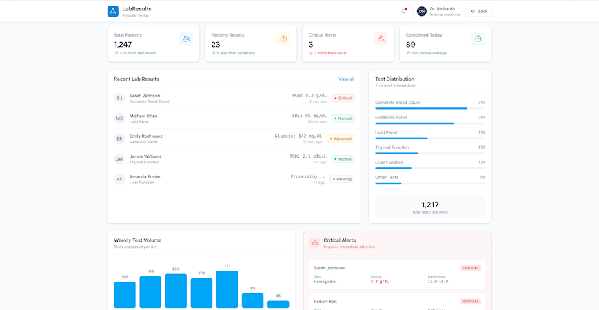
Staff Review Queue
This is the operational backbone. If staff can’t manage volume here, you don’t have a workflow product—you have a results gallery.
What It Must Show
- Buckets: New, Abnormal, Critical (or equivalent)
- Sort/filters that support the day-to-day reality (newest first, oldest unreviewed, critical at top)
- Ownership/assignment indicator (who’s responsible)
- Acknowledgment tracking: reviewed, escalated, released (with timestamps)
What It Must Prove
A staff member can reliably clear the queue and confidently answer: “Did we miss anything?” The queue should make missed follow-ups feel impossible, not merely unlikely.
Common V1 Mistake
Treating “reviewed” as a vibe instead of an explicit action. Make it a button. Log it.
Staff Patient Context
This is the “do the right thing” screen. Staff need context to make safe decisions and communicate clearly.
What It Must Show
- Prior results history (at least the last few; trends if available)
- Notes/comments (with a clear distinction between internal notes and patient-visible messages)
- Follow-up tasks and status (open, in progress, done)
- Quick links back to the original report attachment when needed
What It Must Prove
Staff can take the next action without jumping between five tabs or relying on memory. If the app doesn’t reduce cognitive load here, it won’t stick.
Common V1 Mistake
Burying tasks and notes behind separate screens. In V1, context and action should live together. Once lab results trigger follow-ups, tasks, and notes, you’re no longer just displaying data—you’re operating inside broader patient management workflows, whether you planned to or not.
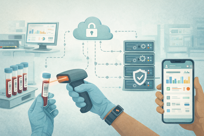
Results Ingestion for MVP
Every blood test app eventually becomes an ingestion problem. But in V1, you don’t need the “perfect pipeline.” You need a reliable way to get test reports into the system with enough structure to power the screens you just designed.
Pick one ingestion path for V1. Commit to it. Ship. Then upgrade.
Option A: Manual Entry
This is the fastest path when you control the workflow (pilot, single clinic, small program) and you’re validating product-market fit—not building a national lab network.
What It Looks Like in V1
- Staff creates a Lab Result for a patient
- Adds panels/analytes with values and units
- Sets flags for abnormal values (manually or by rule)
- Attaches the original report (optional but recommended)
- Marks it reviewed/released
What It Proves
- Your workflow, screens, and follow-up mechanics work in real life.
- You can handle edge cases without blaming integrations.
Where It Breaks
Volume. Manual entry doesn’t scale, and it shouldn’t pretend to.
Option B: File Upload
This is the “real-world MVP” path. Labs send PDFs. Patients upload screenshots. Clinics forward reports. File upload respects that messy reality.
What It Looks Like in V1
- Upload a file and attach it to a Lab Result
- Capture minimal metadata: date, lab name/source, panel name (optional), status
- Optionally enter a small subset of structured values (just enough to power abnormal flags and trends)
What It Proves
- You can centralize test reports fast and make them accessible.
- You can reduce the “where is that result?” chaos immediately.
Key V1 Decision
Are you shipping “viewer-first” (file + metadata), or “structured-first” (file + key analytes)?
- Viewer-first ships faster.
- Structured-first gives better UX but adds workload.
Where It Breaks
Trend views and search become limited if everything stays trapped in PDFs. That’s okay for V1—just be honest about it in your roadmap.
Option C: One Source Feed (Phase 2+)
This is where people get tempted to start. It’s also where MVP timelines go to die. For V1, treat integration as an upgrade path:
- Start with one source
- Make sure it maps cleanly into your existing data model
- Keep the workflow rules the same (review → release → follow-up)
What It Looks Like
- A Lab Result arrives with structured panels/analytes
- Provenance is recorded (source, timestamps)
- Staff review/release rules still apply
- Audit trail stays intact
What It Proves
- Your app can handle automation without changing its responsibility.
- “Ingestion” doesn’t become a second product.
Where It Breaks
Normalization across different sources. That’s a longer game. Don’t pretend it’s a weekend task.
How to Choose Your V1 Ingestion Path
Use this decision rule:
- If you’re piloting with a small team and need speed: Manual Entry
- If your users already live in PDFs and you need immediate value: File Upload
- If you have one committed source and strong technical support: One Source Feed (later)
The main trap is trying to combine all three in V1. That doesn’t make you “flexible.” It makes you permanently unfinished.
Abnormal vs Critical: The Minimum Viable Safety Model
Most blood test apps fail in a very boring way: the results exist, the UI looks fine, and yet the system still lets important follow-ups slip through. Not because people are careless—because the app never made responsibility explicit.
Your V1 safety model only needs three things:
- A consistent way to classify results
- A predictable way to notify the right humans
- A hard audit trail for the moments that matter

Classification Rules
Start with a simple, defensible classification scheme. You’re not diagnosing anything. You’re organizing attention.
Normal
- Within reference range (or no flag set)
Abnormal
- Outside range, but not urgent
- Requires follow-up context, not immediate escalation
Critical
- Outside a critical threshold OR flagged as critical by policy
- Requires staff attention fast
Make it configurable, but not chaotic:
- Reference ranges and thresholds should be set by an admin (or clinical lead)
- Store the thresholds used at the time of classification so the app can explain “why this was flagged” later
- If your data source provides flags, store them—but don’t rely on them blindly without traceability
If you don’t have structured analytes yet (file-only ingestion), you can still classify at the result level:
- staff marks a result as normal/abnormal/critical during review
- the choice is logged
- release rules depend on that classification
Notification Policy
This is where your product stops being a viewer and starts being operationally useful. Keep the policy simple and consistent.
Normal
- Notify patient that results are available
- No staff escalation required
Abnormal
- Notify patient that results are available
- Present a clear next step (“Please message the clinic” or “Schedule a follow-up”)
- Optional: notify staff if your workflow requires a clinician message
Critical
- Notify staff immediately (in-app + whatever channel your organization uses)
- Require staff acknowledgment
- Patient notification depends on policy, but it should never be the only action
Critical results must create a staff-owned obligation inside the app. If it’s just a notification, it’s not a system—it’s a hope.
Audit and Acknowledgment
If you want clinics to trust the workflow, you need receipts.
At minimum, log:
- result created/imported + source
- who viewed (patient and staff)
- who reviewed
- who released (and when it became visible to the patient)
- who acknowledged a critical result
- what follow-up task was created and by whom
- any changes to values, flags, or thresholds (with before/after)
For critical results, require a clear action like:
- “Acknowledge and assign”
- “Acknowledge and contact patient”
- “Acknowledge and escalate”
Even if it’s a single button in V1, it converts a scary scenario into a controlled workflow.
Without explicit role-based access and authentication, abnormal and critical workflows quietly fall apart—because the system can’t reliably enforce who is allowed to review, release, or acknowledge results.
What This Model Prevents
This V1 safety model is intentionally modest, but it shuts down the most common failure modes:
- “We assumed someone else saw it.”
- “The patient got notified but no one followed up.”
- “We can’t prove who reviewed it.”
- “We can’t explain why it was flagged.”
V2 Roadmap: What to Add Only After V1 Works
V1 is about shipping a workflow that doesn’t break under real usage: results arrive, people can read them, abnormal vs critical gets handled, and follow-ups don’t disappear into the void.
Once that’s stable, V2 is where you add leverage—without changing what your app is responsible for.
Trends and Longitudinal Views
After patients can reliably find and understand a single result, the next value jump is helping them see patterns.
What to add in V2:
- Trend lines for selected analytes (not everything—start with the top 10 you see most)
- “Compare to last time” deltas with dates
- Simple grouping by panel type (so the timeline isn’t a soup)
- Patient-friendly context blocks like “this has been stable” or “this moved up since last test” (descriptive, not diagnostic)
What to avoid:
- Automated conclusions (“this trend means you have X”)
- Alarmist UX that spikes anxiety without adding clarity
More Roles
V1 can get away with Patient / Staff / Admin. V2 is where reality shows up: different staff types, different clinics, different responsibilities.
Common role expansions:
- Separate Staff into clinical vs front office vs care coordinator
- Multi-clinic scoping (clinic A staff can’t see clinic B patients)
- Lab operations role (if your workflow includes verification or reconciliation)
- Supervisory views (oversight without blanket access)
The key in V2 is not “more roles.” It’s more predictable scoping. Every new role should have a simple reason to exist and a clear permission boundary.
Integrations
V1 ingestion is intentionally pragmatic. V2 is where you earn speed and reduce manual work—by expanding how results enter the system.
V2 integration goals:
- Move from file/manual to structured feeds where possible
- Support more than one source without breaking your data model
- Improve normalization so trends and search become first-class citizens
- Strengthen provenance tracking (source, timestamps, mapping confidence)
A good V2 mindset: Integrations should reduce operational burden, not create a second product you now have to babysit.
AI Helpers
AI belongs in this product, but only in roles that are strictly non-diagnostic and workflow-supportive. Think “reduce confusion and admin work,” not “medical advice generator.”
Safe V2 AI helpers:
- Result summaries in plain language with conservative phrasing
- Questions to ask your clinician based on the result type
- Message drafts for staff replying to common patient questions
- Triage suggestions that route to a workflow (“schedule follow-up,” “request repeat test”), with clinician/staff oversight and a clear “final decision is human” posture
Where AI goes wrong fast:
- Any output that looks like a clinical conclusion
- Any “you probably have…” language
- Any automation that bypasses staff review for abnormal/critical scenarios
If AI can’t be explained as “a helper that reduces friction,” it doesn’t belong here.
V2 is not about being flashy. It’s about compounding value on top of a V1 that already behaves like a dependable system.

When Specode Is Enough—and When You’ll Need Custom Work
A blood test app can be deceptively simple: “show results, flag abnormal values, let staff follow up.” That’s exactly why it’s a great candidate for a fast V1. The trick is knowing when you’re still building a lab results workflow app… and when you’ve wandered into integration-heavy infrastructure work.
Specode Fits When
Specode is a strong fit if your goal is to ship a real MVP with a clear workflow and a controlled scope:
- You’re building for one program or one clinic (or a small pilot) with a shared workflow.
- Your V1 ingestion is pragmatic (manual entry or file upload; maybe one source later).
- Your product is workflow-first: results timeline → result details → review queue → follow-up tasks.
- You can define deterministic access rules (patient sees own, staff sees assigned/scope).
- You want to iterate quickly using AI-built assembly, role-scoped testing, and guardrails rather than rebuilding everything from scratch.
In other words: you’re optimizing for “get to usable” fast, then improve.
Custom Work Shows Up When
Custom work usually appears for one of three reasons: integration surface area, data normalization depth, or enterprise process.
Typical triggers:
- Multiple lab partners / multiple sources with inconsistent formats and edge cases.
- Deep interoperability requirements (you’re not just consuming results; you’re reconciling identities, orders, and mappings across systems).
- Advanced normalization (cross-lab analyte naming, units conversion, reference ranges by lab, longitudinal analytics that must be consistent across sources).
- Enterprise procurement realities (security reviews, vendor questionnaires, “prove it” documentation, unique workflows across departments).
This is usually the point where EHR integration requirements enter the conversation—bringing tighter workflows, more roles, and expectations that go well beyond a single results viewer.
That’s also where having an experienced team matters—because complexity isn’t in the UI, it’s in everything that happens before the UI can be trusted.
One important nuance: “Custom” doesn’t have to mean “start over.” Specode is explicitly designed for your team or ours—you can pair the fast platform build with managed help and custom code on the Custom tier when you hit unique logic or deeper integration needs.
Want to see progress fast? Get started with Specode and build the first slice.
Hit a snag or want a quick sanity check before you go further? Send your V1 scope in 8–10 bullets and we’ll tell you what’s best done in Specode versus custom work.
Frequently asked questions
A results timeline, a result details view (panels/analytes/ranges/flags), a staff review queue, basic follow-up tasks, and an audit trail for key actions like view/review/release/acknowledge.
Flag values using reference ranges and thresholds, explain them conservatively, and route next steps to clinician workflows instead of generating medical conclusions or treatment guidance.
Pick one path: manual entry for pilots, file upload for real-world speed, or a single structured source later; don’t combine all three in V1 unless you want permanent “almost done” status.
Because critical results need explicit ownership and acknowledgment; the queue is what prevents “we assumed someone else saw it” from becoming your operating model.
Specode is enough for a clear MVP with limited integration surface area; custom work typically appears when you have multiple lab sources, deeper interoperability needs, advanced normalization, or enterprise process requirements.